-
Brief
Le Lombard asked Reed to design their new online platform, where readers could discover and buy their catalogue of titles.
-
Solution
Our approach was inspired by a physical bookshop, catering for both keen and more occasional readers. The most important thing was to inspire the visitor and help them discover what they want.
-
Results
For this reason, we directed the user experience towards guidance and discovery, resulting in a better overall performance of the site.
Strategy
We were inspired by the actual physical experience of finding joy in a bookshop.
We’ve had the pleasure of working with the Média-Participations group (Dupuis, Dargaud, etc.) several times. When we were asked to redesign the Lombard site, our vision was clear: with an ever-increasing stream of new products available, how could we stand out from the crowd?
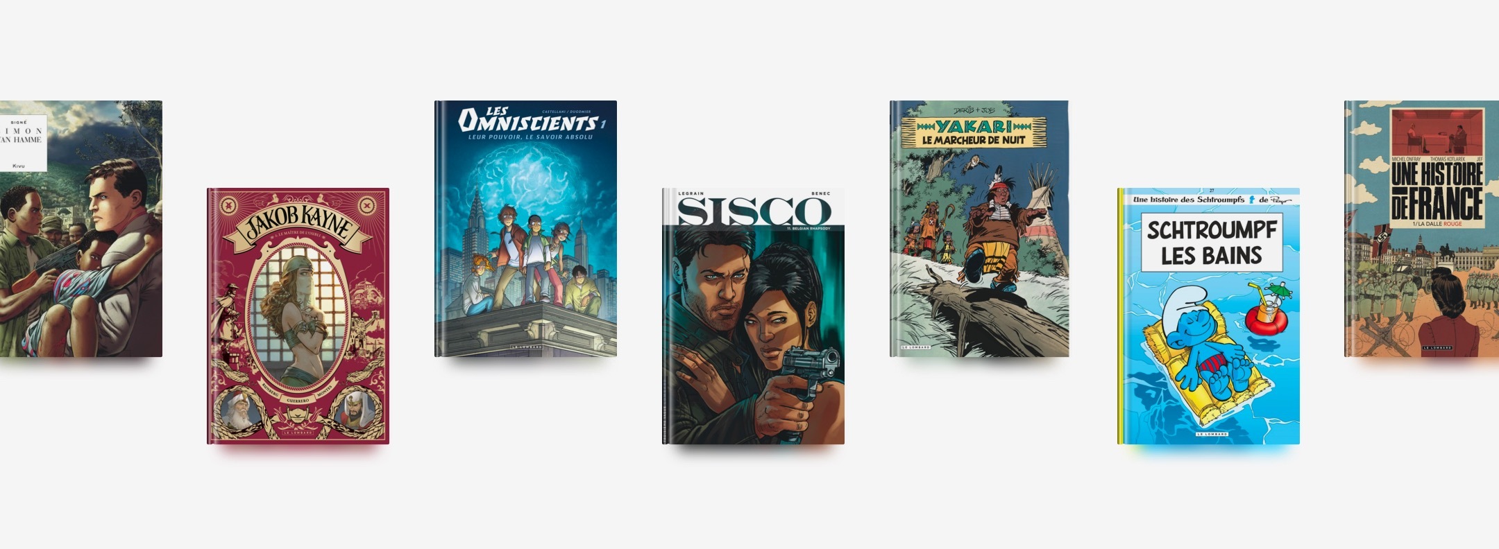
Every time a customer buys a comic book, there’s a chance it might be a new favourite!
How could we design the site to look less like a catalogue and more like an experience of discovery? We wanted to help users make the right choice for them; this is why our inspiration turned towards the most fundamental of guides: booksellers.
As well as offering great visibility of the books in the ‘window’, we sought to digitalise the physical experience using tools to guide the visitor through the shop: favourite picks, advice, thematic lists, etc.
Overall, our intervention produced a 30% increase in visitor numbers to the site, 20% of which were organic visits from search engines.
Interface design
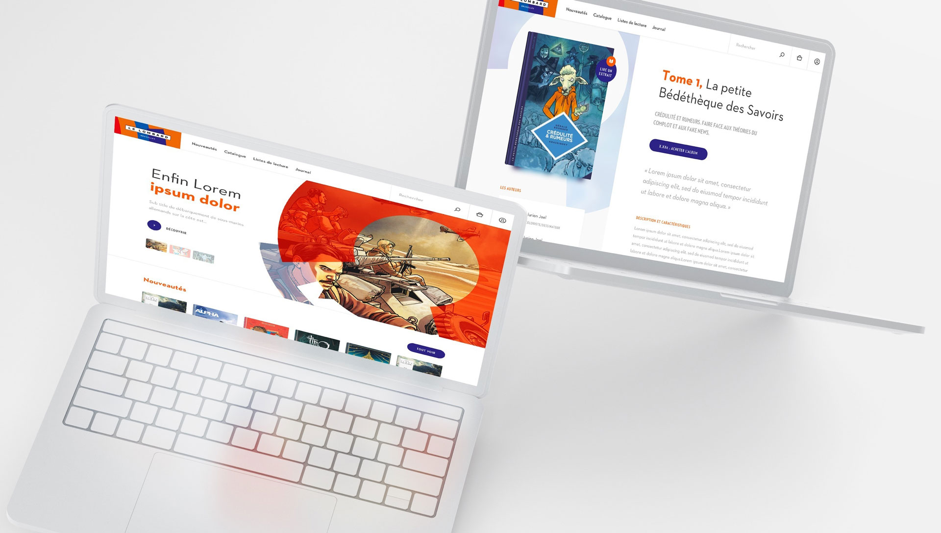
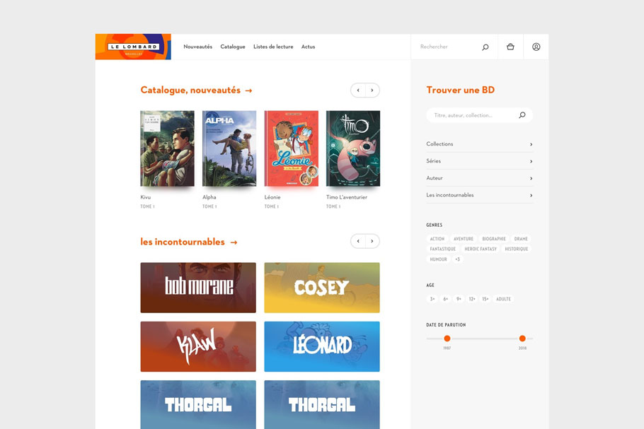
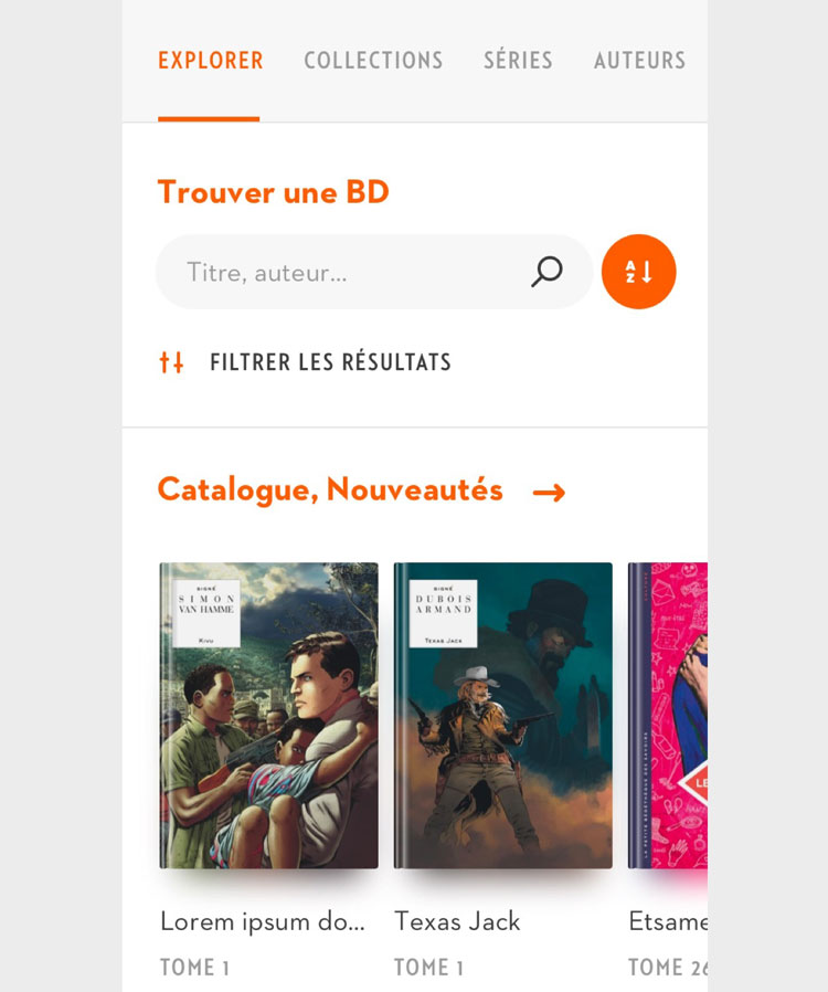
Bringing an ‘intelligent’ catalogue to life
For us, creating an ‘intelligent’ catalogue is designing one which encourages new discovery. Another important factor, however, is to reassure the customer about their choice, something they need to feel in order to complete the purchase.
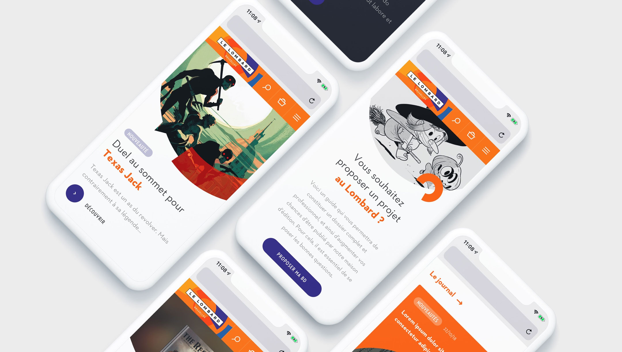
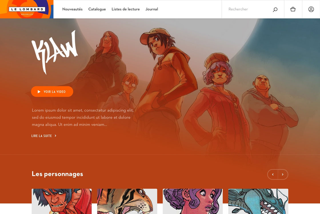
This is why, from the welcome page, we featured lists: new in, upcoming publications, themes, not-to-be-missed, but also a quick search feature allowing regular users to find exactly what they are looking for.
We made enough space on the welcome page for promotions. Spaces of different sizes offer various levels of visibility according to the release date of the publication. It’s important to remember that every publisher works on the follow-up of a creation for a long period of time, and when it’s released, they want to give it the best chance of being noticed. This is why we planned well for sufficient visibility spaces.
We integrated the following:
Focus on what's new
Shared reading lists to inspire the visitor and organise collaborations with influencers
A search engine on every page, as well as a filtering system adapted to quick searches
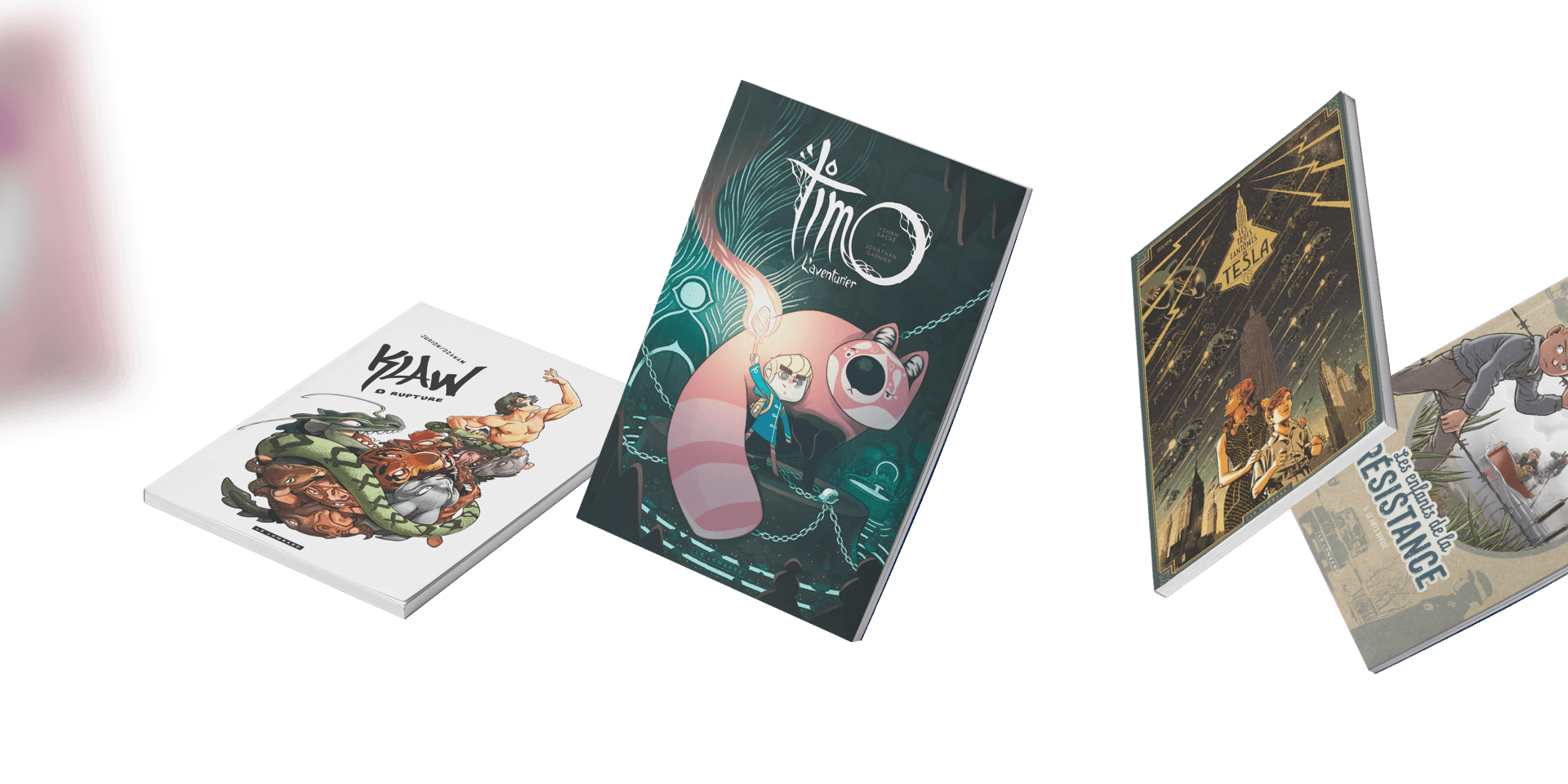
The catalogue must also be inspiring, which means that the interface must ‘fade out’ to allow the creations to take centre stage visually, while maintaining a coherent whole. This is why we made the covers as big as possible.
Technical development
The Lombard catalogue comprises several thousands of products, hundreds of which need to be shown simultaneously, and all of which are synchronised with a client-centralised database. The technical challenge lay in managing the quantities of titles and sizes of large images, while maintaining optimal loading time.
For this project, we used Craft CMS again, in order to provide our client with a user-friendly interface while also automating vast numbers of processes in order to save the client precious time in site management.